

Today marks 20 years since Georgia changed its flag! They got rid of a, IMO quite ugly, brown flag, replacing it with the much prettier red and white flag of the medieval Kingdom of Georgia.
2y 5mon ago in vexillology from files.catbox.moeThen let's do some inane arguing!
It all depends on your color model. If you would use CMYK instead you would see that burgundy is a combination of magenta, yellow and black, just as brown is.
The definition of brown can definitely include blue as well, e.g. W3C defines the keyword brown as rgb(165, 42, 42).
I think it's more about where you draw the line between red and brown, which is individual and cultural. Apparently, my view on this might be a bit controversial. I first saw the old Georgian flag as a small child that did not know fancy words like "burgundy" and "maroon". It seemed brown to me, and so it has remained in my mind, even if it would be more exact to describe it as some nuance brownish shade of red, or reddish shade of brown.
You can also have a look at the Wikipedia page with shades of brown, and I'm sure you will find that people can be way crazier than me when it comes to describing things as brown. Like, how can wheat, bone, moles or black olives be brown?

Today, December 10, Evenkia day is celebrated. Evenks are a Tungusic people living in Siberia. Here's a (possible) flag of the Evenks.
2y 6mon ago in vexillology from upload.wikimedia.org
Flags of Swedish provinces
2y 6mon ago in vexillology from files.catbox.moeJämtland does not want to play with the other boring kids anyway. They consider themselves an independent republic standing above puny provincial flags. Because the flag was created for the Republic Jamtland, it looks different than all other provincial flags.

Which of these South Dakota redesigns looks best?
2y 6mon ago in vexillology from media.kbin.socialVersion 1 IMO. No need to add features to an already nice sun. Any background on the design?
Trapezoids at the hoist side is a quite rare feature on flag, existing in the shadow of many triangles. What do you think about it?
2y 6mon ago in vexillology from images2.imgbox.com
Some U.S. territorial flag remakes
2y 6mon ago in vexillology from media.kbin.socialNice work! So much better than the existing flags, both the design and the well thought symbolism. Though Puerto Rico's flag hardly needs changing IMO, it is already great as it is.

The 6 finalists for Minnesota's new state flag
2y 6mon ago in vexillology from www.mprnews.orgThese two are probably my favourites:


Not to much a fan of swirly designs like this, looks too much like a logo and not so much like a flag:

But mostly, I'm disappointed that my laser loon flag did not qualify as a finalist:


The flag of Angola was adopted on this day (11 November 1975). It stands out with the machete and cogwheel, bearing clear resemblance to the communist hammer and sickle.
2y 7mon ago in vexillology from upload.wikimedia.org
Redesign of the flag of Chad (so we don't confuse it with Romania any more). The waves symbolize Lake Chad, the rising sun a new beginning.
2y 7mon ago in vexillology from files.catbox.moe
Today (November 3) marks 45 years since Dominica adopted its flag. It is the only national flag using the color purple outside a coat of arms. (El Salvador and Nicaragua have purple in their CoA).
2y 7mon ago in vexillology from upload.wikimedia.org
Which tricolor flag do you think is the ugliest, considering only the color combination? Here are some candidates that I have found.
2y 7mon ago in vexillology from files.catbox.moe
Today is the anniversary of the independence of Turkmenistan in 1991. Soon after, a new flag was adopted. With its carpet patterns, Turkmenistan possibly has the world's most complex national flag
2y 7mon ago in vexillology from upload.wikimedia.org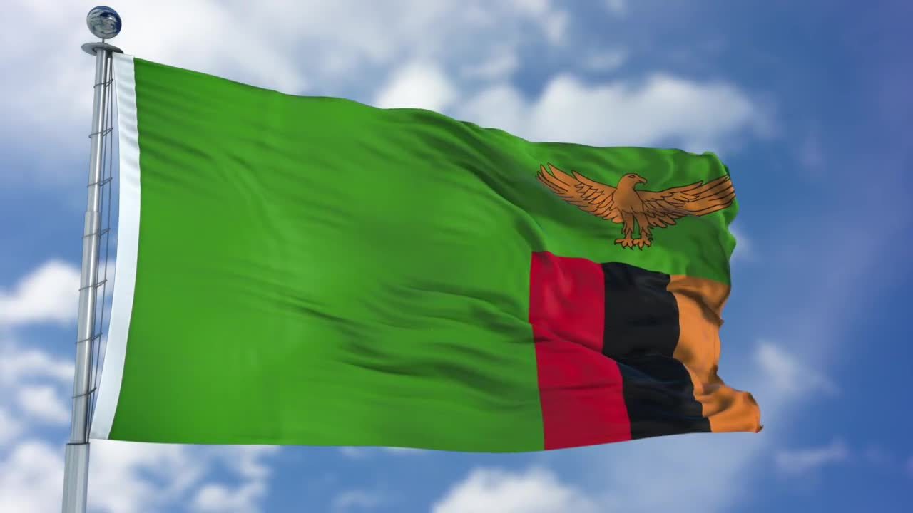
Today (October 24) Zambia celebrates its independence day and the adoption of its national flag. The flag is notable for the uncommon choice of having the emblem on the flyside.
2y 7mon ago in vexillology from images2.imgbox.com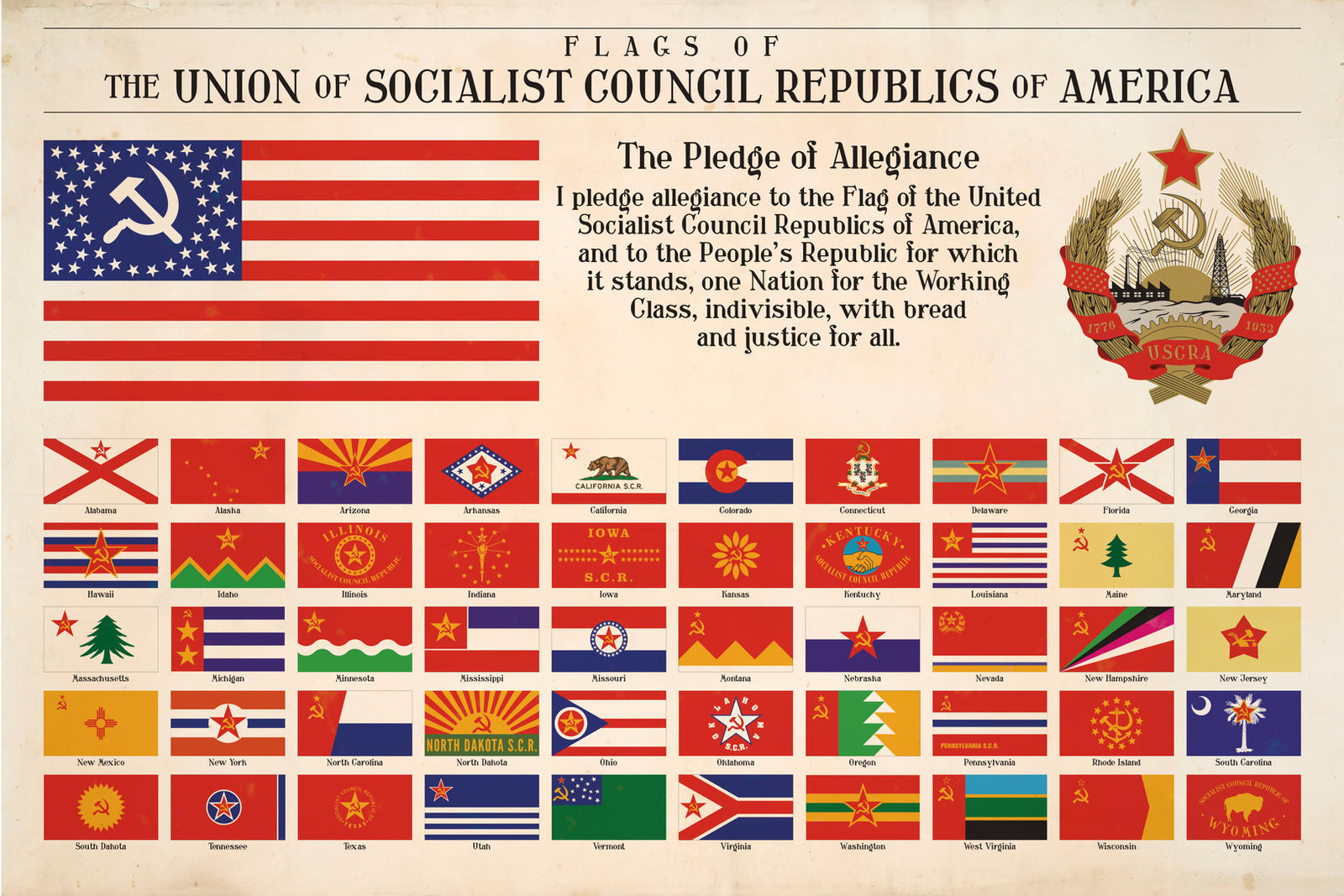
State flags of the imaginary Union of Socialist Council Republics of America
2y 9mon ago in vexillology from images2.imgbox.comWell, many of the flags of the Soviet Republics were basically the same as well. And of course many of the US state flags (SOB). The similarity might simply be due to laziness, but it is quite realistic as well.

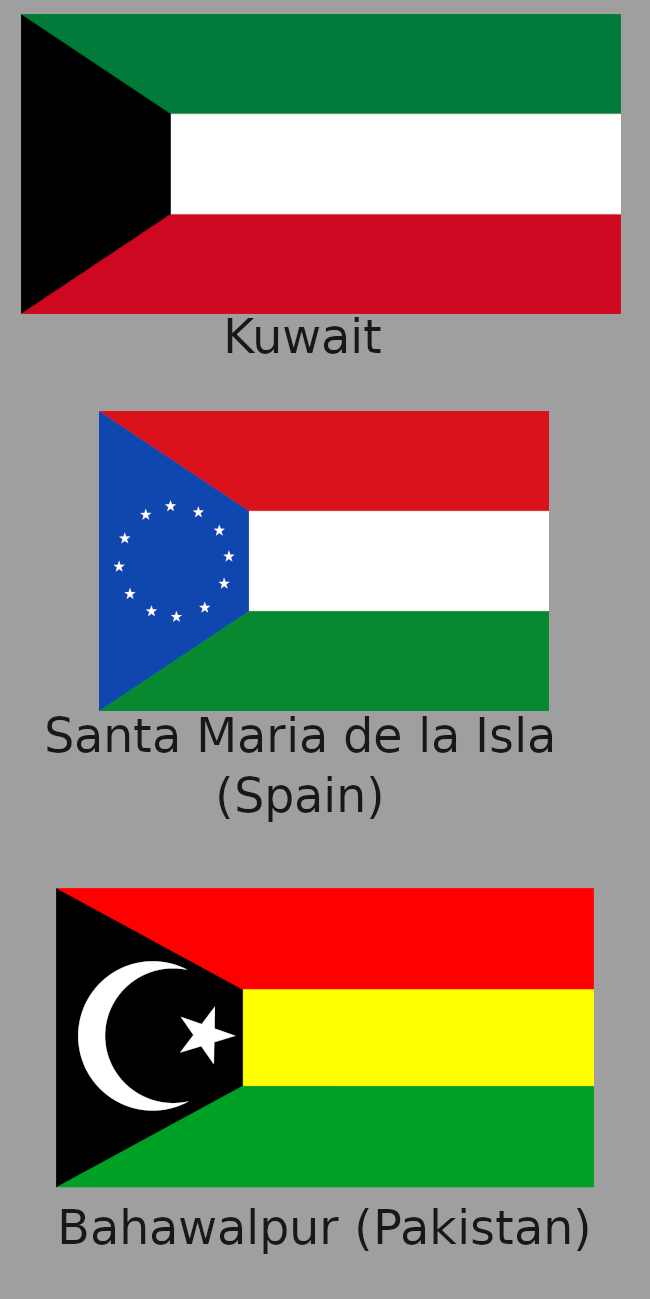
Flag of Sudan for the Bandung Conference in 1955
2y 9mon ago in vexillology from szmer.infoReminds me of this proposed flag of Kuwait from 1906.


My Pennsylvania state flag redesign
2y 9mon ago in vexillology from media.kbin.socialNice and well thought out flag! It ticks all boxes for a good design.
I think I prefer this to the most famous keystone proposal. Putting the keystones in the middle make them more clearly look like keystones, rather than just a strange middle field. Matching William Penn's coat of arms is also a nice bonus.
Popular "keystone" proposal for reference:
