Sync for Lemmy v120 release notes. Notifications, revamped messaging and finally out of beta!
2y 2mon ago by lemmy.world/u/ljdawson in syncforlemmy
Key points
- Message notifications are back!
- A big refresh to messaging
- Added a new unified inbox option "all" combining comment replies, mentions and direct messages
- Quick action buttons are now shown for comment replies, mentions and direct messages
- Comment reply actions (more icon) now shows the user and community rows (with additional options)
- Comment replies now show the community icon and post title
- Comment replies have had a visual refresh
- Comment replies, mentions and direct messages can now be quickly reported and marked as read
- Comment replies, mentions and direct messages can now be marked as unread
- Added a quickly reply swipe gesture
- Added page dividers
- Your own send direct messages can now be deleted
- Direct messages are now shown in threads
New
- Added .webm support to the image viewer and image peek
- Added "linked instances" and "blocked instances" to the instance chip group
Changes
- Experimenting with always showing the community icon in feeds
- Updated the reply icon
Github issues closed
- View mode not updating properly #402
- No messages returned snackbar doesn't automatically go away #333
- Add ability to disable "view more" toast messages #365
- Allow images in comments to use shared element transitions #391
- Add new app icons to replace the legacy S4R ones that were removed #389
- Add option to swap upvote and down vote colors to match Lemmy #386
- Username doesn't show in the account picker if there is no display name #451
- Account settings save button not disappearing after saving #448
- When swapping between automatic and manual theming, some elements don't change color properly #479
- Override sort dialog shows cancel button twice #484
- Username of non active account in account picker is empty #492
- Crash on startup with latest update #445
- Missing username in picker #478
- Not showing link options properly and crashing when clicked #513
Other fixes
- Fixed a title displaying issue caused by the recent change to titles
- Fixed a crash when clicking link options on a text post
- Fixed a bug where the description of the current messaging section in the toolbar wouldn't update correctly
- Fixed an issue with a broken lift target in messaging causing the status bar not to change color
v122 adds support for a super secret upcoming new feature...
This is exactly the reason, after using Sync for YEARS on reddit, I paid for Sync on Lemmy the minute it was available.
This is absolutely the best application for browsing this type of forum. I get why some other folks prefer FOSS/Free/Non-ad based apps, but I have no qualms about shelling out the cash for a really well designed app that I use just about daily.
(シ_ _)シ
Yeah its not even close. Lj, you are an extremely skilled developer. Thanks for making such a good app
When are we getting another update?
Sync apps have been my go-to for 10 years. Here's to 10 more 🍻
🍻
Added .webm support to the image viewer and image peek
This, along with the other image viewer fixes is a massive quality of life upgrade! 🙌
Holy shit. This looks like an epic update!
Sync is actually just the best.
You're the best LD!
♥️
In the play store description I noticed you refer to "subs" but they're called "communities" here.
Cheers I'll change that.
Great. You've been killing it lately, thank you.
While you're at it this setting should probably say "Body" or maybe "post body" instead of "selftext".
Settings shortcut: View type > Show selftext previews
Edit: oh, found it in a couple other spots
Settings shortcut: Post options > Long press selftext to select text
It's been "selftext" since day 1 on reddit iirc. This should stay the way it is. It's part of Sync's identity imo.
When i noticed, back then, i found it funny. Idk if it's intentional or a forgotten placeholder that survived.
At a certain point Lemmy and Sync are going to find users that weren't redditors and I could see it causing some confusion. It's minor though. Bothers me less than "subs" for sure.
Hey, think you could tinker with the "Glide Failed to Grab This Image" bug? It's happening more and more now, and it even happens to images I post.
Excellent work boss, as always 👍🏻
Edit: Wow the messaging section is looking good, Sync for Reddit never looked that nice!
Common LJ W. Happy lifetime Ultra supporter.
Superb! Thank you for the hard work!
Thank you so much for the continued updates!
Something about the fixes for usernames not showing up appears to have undone the fix for #122. I can see my username in plaintext for the current account even though I have hidden the display names.
This is awesome, nice work!
Hope push notifications are next! (yes, I'm on Ultra)
Notifications! Yes! Thank you.
(Can someone please reply to this, so that I can test if they work for me? Thanks. 🙂)
Hello, friend
Thanks. It doesn't seem to work though. I've set it to check for messages every 10 minutes but I get no notification. (The app was closed during that time) 🤔
Does anyone have the some problem? I'm on Android 14 on a Pixel 7 Pro.
Able to reproduce this. Seems like setting anything under 15 mins causes an issue. Will patch today.
Doesn't work with a setting > 15 minutes for me either. I currently have it set at 30 minutes and didn't receive a notification about your reply.
Thanks for looking into it!
Can you reply to this to test please.
Here's a test reply.
Seems to be working now.
I've pushed the update through. Hopefully should be live in the next hour or two.
Just installed v121 and I got a notification upon starting the app.
Seems to be working. Thank you!
Update is now available
Great work, thank you. I'm wondering if you've put any more thought into displaying downvotes on comments? Now that post editing is fixed that's basically the only thing I keep going back to the PWA for.
Much preferred the old inbox. If I get 5 replies to a comment I dont need to see the post title above all of them (I dont really want to see it above any of them.) I clicked the "show post titles in replies" option in the messaging options section to off but it made no difference.
I'm wondering that also. The extra functionality is nice but it's going to take some getting used to. I'll adjust though
Any plans on emoji pickers for instances with custom emojis?
Custom emojis also currently render much larger than they should.
New messaging looks awesome!
Is there a way I can bind sync to be my default app for links to my instance? Annoying that someone sends me a lemmy.ca link and I have to go find it manually in sync, or just view it in my browser.
Oh true, Fediverse links are still not handled ideally. I know there's technical limitations to fedi app developers keeping an up-to-date list of domains that their app can open links from, but it would definitely be nice if there were some easier way to do things.
One side note, I've noticed that Megalodon (a Mastodon client) has a pretty good workaround for this issue -- if you use the share sheet to share a link with Megalodon, it gives you the option to post the link or to attempt to open the link in the client. That'd be a pretty killer feature to have in Sync, if there isn't some easier/better way to make it easier to choose certain Lemmy domains to open in Sync by default.
Android Settings -> Apps -> Sync -> Open by default

Ah that makes sense, thanks! I was looking in the sync options.
Edit: odd it doesn't work. I added every domain, then click a lemmy.world link in discord and it still opens chrome
hmmm, not sure if chrome has this, but for Firefox I use the "Open in App" button, since I have "Open links in apps" set to Never.
Though I can replicate your issue, clicking a lemmy link in Discord brings me to Firefox, whereas clicking a YouTube link in Discord takes me directly to the YouTube app (technically the ReX app)
I had the same issue, you could try Lemmy Redirect (the github repo is named after the Mastodon proxy, but the Lemmy one is there as well), works for me.
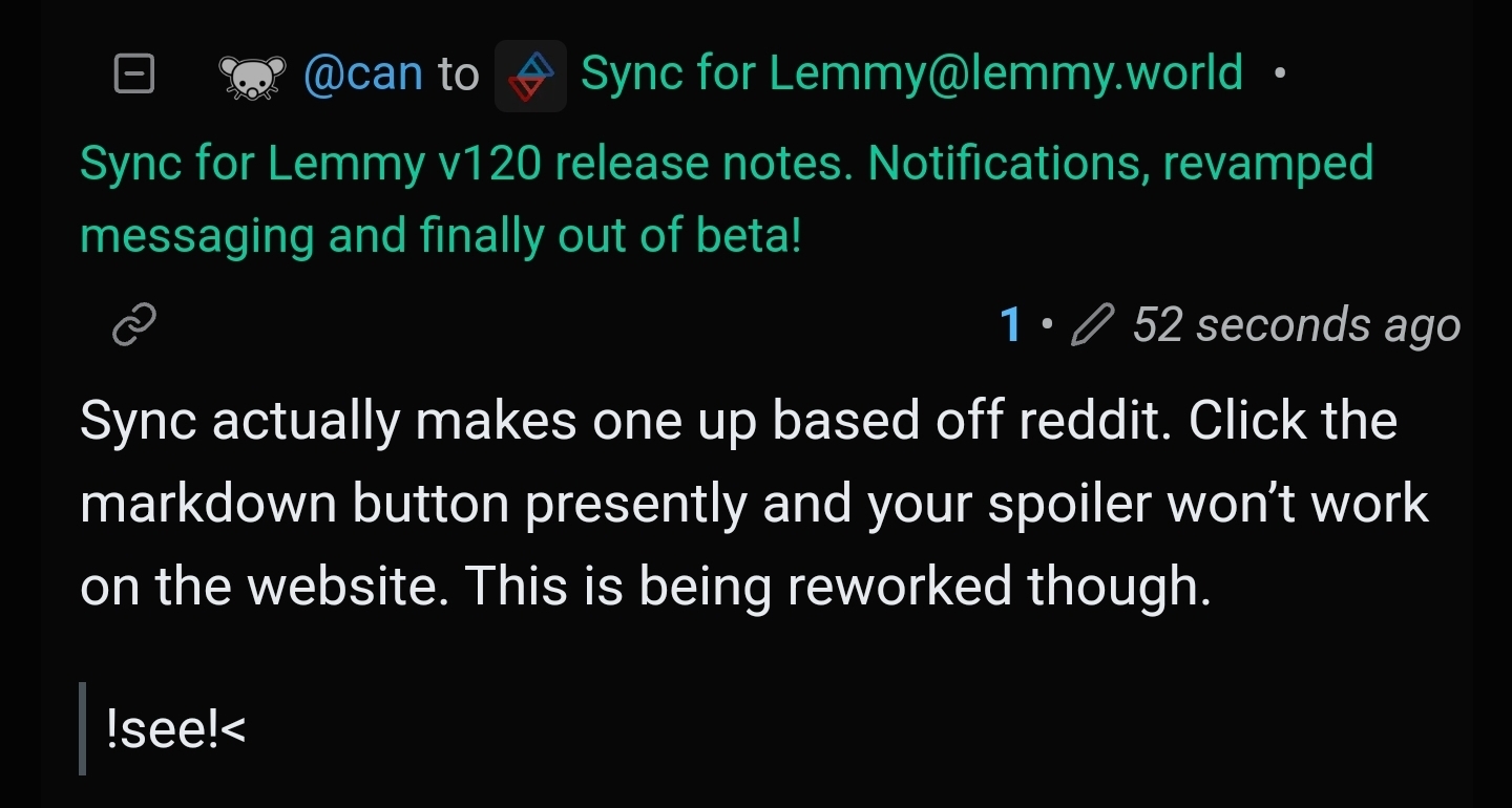
Not sure if you know this already, but spoilers made by people using the website version don't load properly.
The markdown for spoilers can be found here https://join-lemmy.org/docs/users/02-media.html
test spoiler
TEST
Hmm that's weird, that one worked. But if I try viewing this post https://sopuli.xyz/post/10635149,the spoilers are a mess.
My experience exactly when I tried mentioning the spoiler problem (there's a markdown-specific post here if you wanted to add anything else, btw)
I think there are 3 ways of marking spoilers and Sync only recognizes 1 of them or something. Even on this community's about section there's a spoiler that doesn't work in the app.
¯\_ (ツ) _/¯
the spoilers are a mess.
Yup. They are (for now)!
Sync actually makes one up based off reddit. Click the markdown button presently and your spoiler won't work on the website. This is being reworked though.
Nice one.
Thanks boss! Much appreciated
I cannot open the inbox. I get "Error opening page".
Device information
Sync version: v24.03.20-17:18
Sync flavor: googlePlay

View type: Small cards
Push enabled: false

Device: lavender
Model: Xiaomi Redmi Note 7
Android: 10
For all sections?
Yes.
Any chance you could try a different account?
Weird, it works in another account 🙄
I tried. My main one cannot access the inbox, others can. Any ideas?
So just to check if you open say username mentions or direct messages that doesn't work either?
Those work. I only get an error for All and All unread. The others, when empty, respond properly with "No messages returned".
Ok well that's something lol.
Am I able to register an account on that instance? It wasn't lowering for me.
I think so, it should be open for everyone.
The new default inbox view is pretty unreadable, at least for me. The entire screen is filled by like 1.5 replies, there's tons of dead space. Is there any way to change the view options of the inbox? I can't seem to find any.
Not currently. What would you like?
- An option to hide the buttons below each reply unless you short / long press the comment, similar to how the normal comment section currently works. That would compress the space each reply takes by quite a bit.
- An option to replace the post title with the context of the reply, what comment was the reply posted to? The post title is very frequently irrelevant to the actual discussion taking place.
- Have the same swipe options apply to replies as to comments. E.g. upvotes, downvotes, etc.
Granted, I'm not a UI expert, so this is my personal feedback.
Edit to add: This is not to say I hate the changes, love the recent progress on the app :)
Currently, whenever there has been a new reply, the inbox defaults to (and then remains at) "all unread".
I like having it on "all" and would like for it to remain there.
Could this be an option? For messages to remain at whatever tab they were last set to and stay there when there are new messages.
Overall, I prefer the old version. Sometimes I need to be reminded of the context of a reply, I can just tap the reply. Other times it's obvious from the message itself.
Right now the post title font is larger then the reply font. It should be the other way around. The reply should be the most obvious thing, and the ancillary stuff should be small and compact. But including the title at all should be optional, as well as the icons.
I personally don't want to see user avatars or community icons or even the post title, really. I also don't need it to have a cute speech bubble. The reply should use the full width to save vertical space.
There's a lot of wasted space for one line replies. And longer replies end up being taller than need be because of the indent. And seeing the same post title over and over is oddly bothersome.
Excellent!
Question - I notice that the little nav bar dot with a number to indicate new replies or messages is now showing in dark grey rather than orange. I had a look in settings, but I can't see a way to choose the colour for that. Anyone know of a way?
Normally appears here when there's a new reply:

In case it's useful...
Device information
Sync version: v24.03.19-19:12
Sync flavor: googlePlay

View type: Smaller cards
Push enabled: false

Device: raven
Model: Google Pixel 6 Pro
Android: 14
Is your theme base colour grey?
It is, yeah - I guess that's the setting for the notification. Thanks very much :-)
Love the update! Thank you, Mr. LJ!
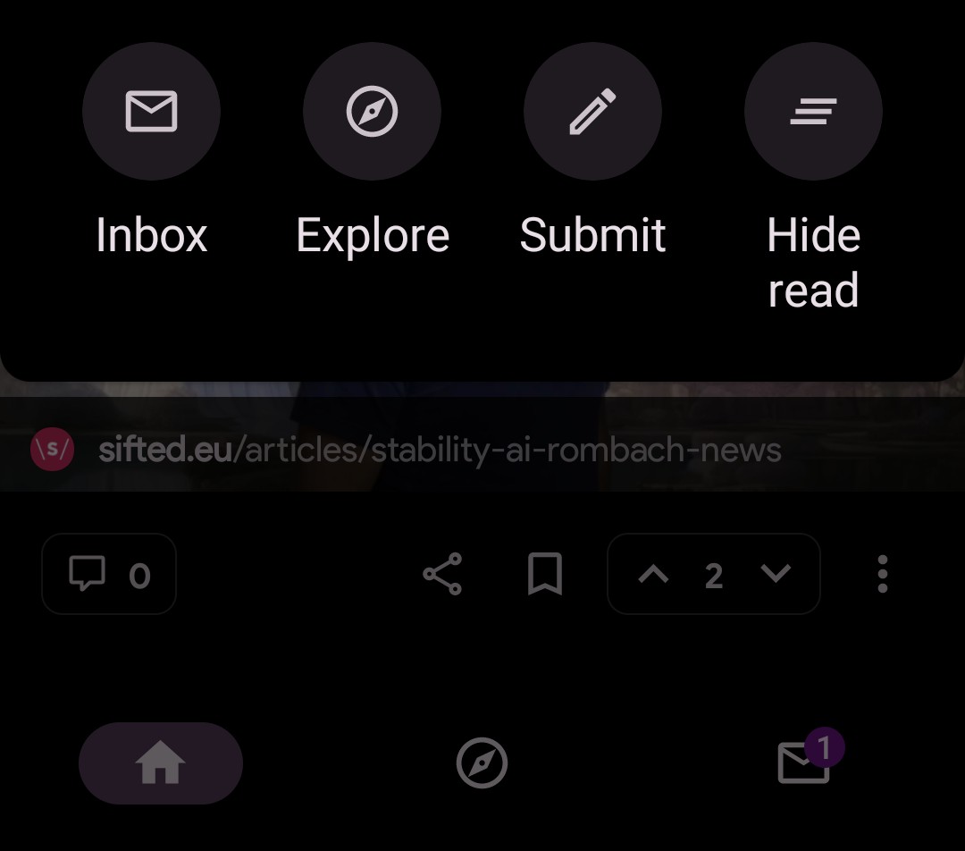
Sadly though, I just got my first reply notification (yay!) … and the inbox notification badge that tells me I have 1 new only shows up on the bottom nav bar and not in my left drawer or more actions inboxes..
I can screenshot them if you need me to.
Which action boxes?
Adding it to the drawer is on my todo
Using the "More Actions" menu via the three-dots button at the top of my Subscribed feed, this is my view:
In the lower left of that menu is my Inbox icon, with no "new messages" badge. (I admit I don't know all the right words) In the dimmed bg you can see my Bottom Nav bar, with a badge on it.
(Cropped view of the 2 inbox icons)
Hi, right now ultra users can either add a new user tag or remove it. Can you please make it editable too? ljdawson@lemmy.world
This is the best app except spoiler is still broken and has been for two years. Dev can we help with this, please post source because the app is so close to perfect.
I wish this Sync had the "sort communities list by times visited" option like Sync for Reddit
Not sure if this is the right place to comment, but I love the recent reordering of comment buttons so Save or Post is the first button. This addresses one of my very few negative thoughts about the UI. Tabbing multiple times to get out of the editor and then hit Enter just became tabbing once. Thank you to the Lemmy team!
Is the free version showing ads ??
Yes, it does show ads. It does that. (The same way a lot of apps handle free-tier.)
There are other Lemmy apps out there that don't show ads, but I think Sync is the most polished of the bunch.